Chase Sapphire®
Sapphire is a lifestyle for the inspired millennial and independent thinkers. The ones who seek authentic experiences, connection, and different perspectives. The following rebrand and campaign explores how you can get more out of life with Chase Sapphire in your wallet.

Same Planet. More World.
The creative platform ‘Same Planet. More World.’ is a vibrant expression of what it means to be a Sapphire cardholder. It’s about contrasting a regular, relatable life moment with the benefits of Sapphire. Simply put, paying for everyday can lead to bigger rewards. I.e. A regular cab ride becomes a way to earn points towards a bigger trip. A normal dinner out gets you closer to your next vacation. Sapphire is the distinct advantage.
Driven by an elevated tone and bold energy; it was important for our work to immerse viewers into the world of Sapphire, as both a feeling and narrative.


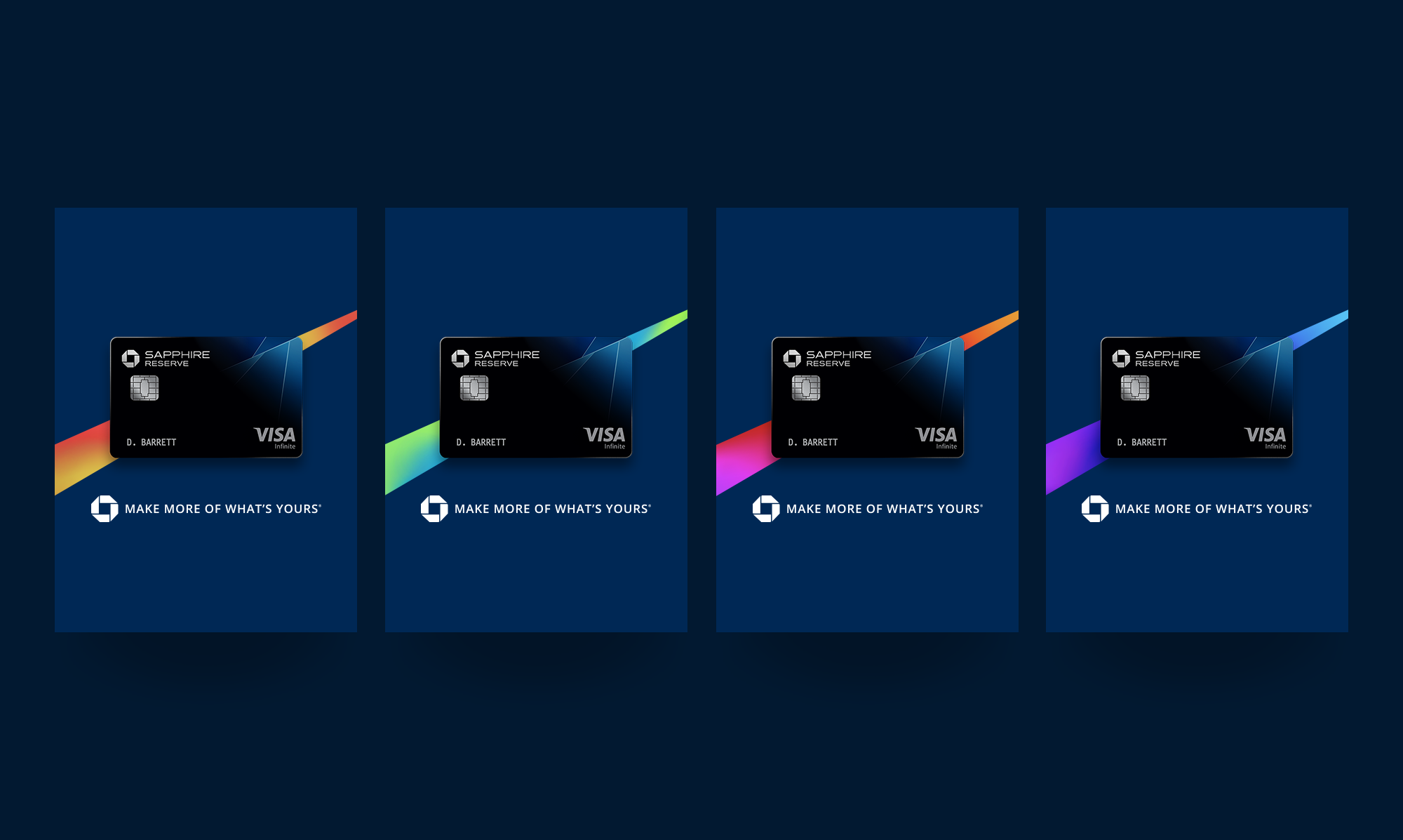
Design DNA
The Same/More construct is ever present across all executions. The design contrasts a regular life moment, with the benefit of what you get in that moment with Sapphire. A bold fractal graphic, inspired by the card art, separates our two worlds.


Photography
The world of Sapphire is where everyday meets extraordinary. Our photography is both aspirational and intriguing. It is rich, elevated, colorful, and liberating. It invites you to join a world of absolute freedom and exploration.


Brand Guidelines
I developed a comprehensive 200 page brand book to detail the Sapphire rebrand. Rules outlined the Chase Masterbrand, Chase Sapphire, and Sapphire Event/Experiences. This guideline was ultimately used as the template for all other Chase card rebrands, including Freedom, Business, and Granite.


Agency: Droga5
Film/Photography: Tom McQueen, George McQueen
Design + Guidelines: Lia Sfiligoj, Mark Yoon